
I have an affiliate relationship with Bookshop.org and Malaprop's Bookstore in beautiful Asheville, NC. I will earn a small commission at no additional cost to you if you purchase merchandise through links on my site. Read more on my affiliate page.
Synopsis from GoodReads:
Discover the hidden patterns in human society as you have never seen them before – through the world of data
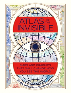
In Atlas of the Invisible, award-winning geographer-designer team James Cheshire and Oliver Uberti redefine what an atlas can be. Transforming enormous data sets into rich maps and cutting-edge visualizations, they uncover truths about our past, reflect on who we are today, and highlight what we face in the years ahead. With their joyfully inquisitive approach, Cheshire and Uberti explore happiness and anxiety levels around the globe; they trace the undersea cables and cell towers that connect us; they examine hidden scars of geopolitics; and illustrate how a warming planet affects everything from hurricanes to the hajj. Years in the making, Atlas of the Invisible invites readers to marvel at the promise and peril of data, and to revel in the secrets and contours of a newly visible world.
My Review:
3.5 Stars, rounded up to 4
In that way that libraries have, I placed holds for two different atlases several weeks apart and they both arrived for pick up on the same day. Has anyone named that law yet?
Being new books, my checkout time was short. Given that there are more holds on them, renewal wasn’t an option. That wasn’t a problem with the first atlas, North American Maps for Curious Minds. It does present some complex information but most of the book is easily digested in a visual format and needed little explanation. I loved that book. My reading of Atlas of the Invisible suffered a bit because I was rushed.
This book shares much more complex data in formats that are unfamiliar to me and probably many other casual readers. There was a lot more text to explain both the data presented and the format. I devoted as much time as I could to it, but an impending return date (today, in fact) limited me. That’s why I’m rounding up.
There are four main parts of the book: Where We’ve Been, Who We Are, How We’re Doing, and What We Face. The first section gives historical maps, such as where enslaved people were taken from and where they ultimately landed or a vague, conceptual map that tries to accurately portray a Holocaust survivor’s muddled, traumatic memories rather than Nazi precision. These maps were sometimes disturbing but generally easy for me to understand and interesting.
The next section show current data such as distance to cities, the flight of Puerto Ricans from their island home after Hurricane Maria, and, one of my favorites, a reconfigured map of the United States showing different states based on population centers and commutes (I would live in the state of Blue Ridge if that idea ever became reality). Again, these maps were mostly easy to understand. One or two didn’t interest me at all but for the most part I found them engaging.
How We’re Doing can be answered with “Not well.” These maps present air and water pollution, gentrification, happiness around the world, and the infamous Doomsday Clock. This is the section where my attention started flagging and I wish I’d had more time. I understood everything but it’s almost all bad news. I could have used a mental break.
What We Face is a climate crisis. Fires, unbearable heat, melting glaciers, earthquakes, and a rapidly growing and aging population. This is not a section to read on a day when you’re feeling anxious about the future. It is a section to show your science-denying Facebook acquaintances. It’s hard to avoid depressing conclusions when data is presented in such a visual format.
It’s not all doom and gloom though. These last two sections in particular also show some unique, targeted, problem-solving technology. We can change our direction if we only give scientists the tools they need and collectively make the necessary changes and decisions.
I recommend this to visual learners who have the time and attention to really devote to it. The subjects aren’t always easy but they’re important and hopefully spur changes in our behavior.
Similar Books:
If you liked Atlas of the Invisible: Maps and Graphics That Will Change How You See the World, you might also like my reviews of
- North American Maps for Curious Minds: 100 New Ways to See the Continent by Matthew Bucklan and Victor Cizek
- The Trivia Lover’s Guide to the World: Geography for the Lost and Found by Gary Fuller
- Drawdown: The Most Comprehensive Plan Ever Proposed to Reverse Global Warming, edited by Paul Hawken
Purchase:
Buy Atlas of the Invisible from Malaprop’s Bookstore in beautiful Asheville, NC or


1 Comment
Huh, this sounds like an interesting book! But yes, definitely one that you’d need to have time to spend with it.