
I have affiliate relationships with Bookshop.org and Malaprop's Bookstore in beautiful Asheville, NC. I will earn a small commission at no additional cost to you if you purchase merchandise through links on my site. Read more on my affiliate page.

Jana at That Artsy Reader Girl invited us to share 10 book covers with unique typography this week. I thought this was an interesting topic. Very often the font on book covers is a very readable but boring sans serif font. I had fun looking for designs that broke the mold.
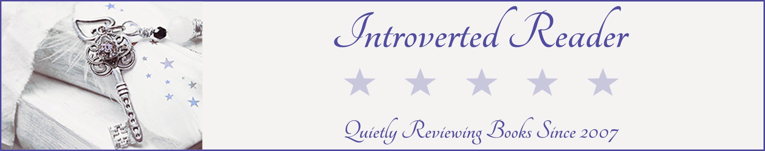
The Sun Down Motel by Simone St. James, read by Brittany Pressley and Kirsten Potter–If I recall correctly, the titular hotel was built in the 1970s, so the font here looks fitting for the time and a neon sign.
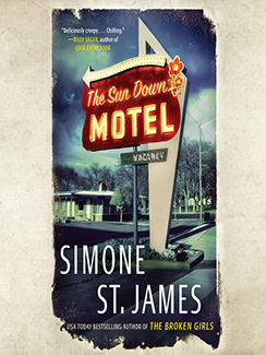
Jackaby (Jackaby #1) by William Ritter, read by Nicola Barber–“Jackaby” is the name of the detective in this fantasy mystery series. This font looks like it could be his signature.
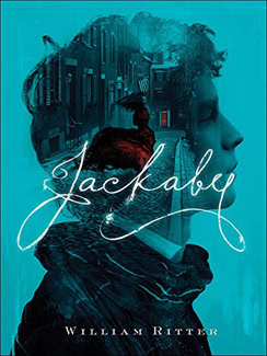
Mairelon the Magician (Mairelon #1) by Patricia Wrede–Mairelon is a street magician in Victorian England. This font looks like it could be on a flyer or other advertisement in those times.
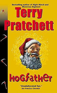
Hogfather (Discworld, #20) by Terry Pratchett–This book is a slapstick comedy with lots of random twists and turns. That font with random upper- and lower-case letters and sizing reflects that perfectly.
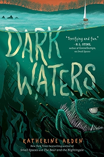
Dark Waters (Small Spaces #3) by Katherine Arden, read by Renee Dorian–This book is set on Lake Champlain and features a mythical lake monster. I love that this font looks like it’s being refracted through light and water and it’s barely above the water line, like it’s sinking. I think this is very well done.
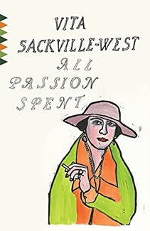
All Passion Spent by Vita Sackville-West–I may be reading too much into this, but Lady Slane, the main character, is an elderly widow. Most of society and even most of her adult children expect her to just quietly fade away until she dies. I think the hollow font shows that they expect her to have a hollow life. But the bright colors on the female figure show us that Lady Slane does not intend to “go gentle into that good night.”
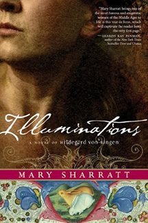
Illuminations: A Novel of Hildegard von Bingen by Mary Sharratt–Hildegard was a real person who was born in 1098 and entered a monastery when she was a pre-teen. She eventually became an Abbess, writer, and composer, among other things. The font looks like something you would see in a medieval manuscript.
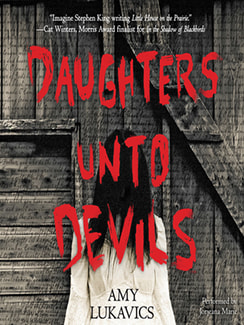
Daughters Unto Devils by Amy Lukavics, read by Jorjeana Marie–This is one of the scariest horror books I’ve ever read. I called it “The Little House on the Shining” when I told my husband about it. That bloody-looking font shows you exactly what you’re in for.
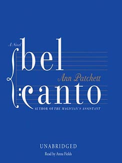
Bel Canto by Ann Patchett, read by Anna Fields–I still think about this book fairly often, and I read it almost 10 years ago. A group of diplomats and various hangers-on are taken hostage at a swanky soiree. One of the hostages is an opera singer. This font is mostly very plain but I like that the “c” looks like a bass clef and the letters are situated on a music staff.
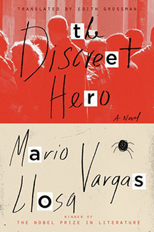
The Discreet Hero by Mario Vargas Llosa, translated by Edith Grossman–One of the main characters in this book is basically being blackmailed. This looks like a blackmailer’s note with hastily-written script mixed with letters cut from a magazine or newspaper.
That’s my list! Have you read any of these? Which books did/would you choose? Link up every Tuesday at That Artsy Reader Girl!

13 Comments
I love the cover art for the annotated edition of Bel Canto. I still have my paperback edition of the book from when I read it many years ago (and loved it!), but decided to get a copy of this new edition and plan to read it sometime this spring.
That DARK WATERS cover is terrifying. Yikes!
Happy TTT (on a Wednesday)!
Susan
http://www.blogginboutbooks.com
A great collection of covers!
Pam @ Read! Bake! Create!
https://readbakecreate.com/the-ss-have-it-ten-titles-starting-with-s/
These are all great choices. I almost added a book from the Small Spaces series as well. They do a great job with typography!
These are pretty great! I think my favorite is Bel Canto. Have a great week!
The Sun Down Motel cover is delightful. I like Dark Waters, too.
Great list! I particularly love how Bel Canto looks like it belongs on the musical staff.
Great selections, I like Dark Waters and The Discrete Hero
Thanks for sharing your #TTT
What a fun prompt. You chose some excellent ones.
I’ve never thought about how appropriate the typography of Bel Canto before compared to the story. I love it. The Sundown Motel is also super cool.
Dark Waters is a great choice! I thought all the covers for the entire Small Spaces series were so pretty.
Hogsfather is great.
Here is our Top Ten Tuesday.
Dark Waters couldn’t have a better cover!